Sunday, 22 November 2009

Where am I Now?

1. My initial idea was to look at family photos and the power they have. I wanted to focus especially on portrait, and how personality can be shown in raw, exposed flesh, because i think that is where an individuals persona is rooted- forgetting all make up and clothing. This links to family photos and how an individuals character is firmly rooted in their past, as who they were born to be.

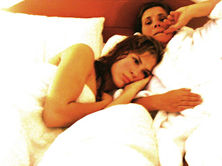
2. I took photos of my sister Eleanor who is 20, on a beach in france. They were completely unplanned and spontaneous She had just been swimming so her hair was wet, she had no make up on and just a white t-shirt and the focus is on her face and her expression- again un-posed and genuinely happy, not forced. But i had just 2 of these photos and wanted more that were in colour, so i took photos of her lying on my mums bed, wrapped up in a towel again clear of make up and jewelry, and she looks very calm and sleepy. Her essence is not being disguised and because she's not really doing anything the focus is not distracted.

3. I think my most successful observational drawing is the one i ended up painting. Eleanor is curled up in her towel and duvet against my mum and looks very sleepy and slightly angry, but vulnerable. I liked this one the most because i like the composition of her hand and her arm and her face and her hair and the duvet. I think its my most successful because i was braver with this than the others in showing contrast between flesh and fabric, and because i picked out greens and grey's in her skin to make it more striking.

4. I looked at lucien freud and paula rego, but decided mainly to focus on rego. Freud i am using only as an inspiration for technique with attention to detail and skin. I liked the idea of putting a Rego style twist on my work, because i like her interest in women's vulnerability and sensitivity as well as childhood memory and how it can play such an important role in what you're going to be like in the future. This links back to the childhood and family photos at the start of my book- finally things are starting to come together, though in ways i did not predict!!

5. My plan NOW is to develop my images with the same idea of rawness of flesh, but bringing in a sinister approach, thinking of ideas like traditional sleeping beauty, and duke bluebeard which i saw at the opera. This way i can add splashes of colour and vibrancy, with ideas like fake flowers and wreathes, and adding layers of silk to the duvet- making the idea more fantastical and surreal.

Art at the Opera- Expanding on Inspiration


I went to see Duke Bluebeard's Castle at the Colloseum this november and loved it. The disturbing nature of the sexism and objectification over women reminded me so much of Paula Rego's work. The power of the lead female Judith is immense on stage, but what is even more powerful is the force that she is degraded by the Fritzl style character who traps her in his castle, in which his huge incestual family live already. He gradually gets her covered in blood from the various rooms he exposes her too; none of the blood yet is hers- all fresh from the other women he was claimed his own- a very disturbing visual feature of the production. The metaphorical imagery is amazing, and the set design is the best i've ever seen anywhere- its phenomenal. The textures and layers of the set reveal dirt and rubble in contrast to completely fake bright flowers, building blocks and jeweled manikins. There are creepy, rusty tricycles and toys that his children play with, oblivious to how wrong this all is. They play content, having never experienced an outside life, again, all very disturbing. Creepy sums up the whole production really, and the schizophrenic nature with which he abuses and then adores his wife, is especially strong.

The ending in particular rang resonances of Rego's 'Dog women" paintings. In the opera the four women lie down on a rugged stained mattress, with the duke in the centre holding a knife, and with their thighs split open, covered in dry blood and dirt- succumbing to his power. It is both horrifying but artistically stunning at the same time- exactly like Rego's thirst for "Gruesome Beauty" as seen in the article. It was almost like a 3D production of Paula Regos work- like a show case- beautifully shocking.

Thursday, 29 October 2009

Artist Inspiration


My favorite gallery in London is definitely the national, and in fact i don't think many galleries worldwide compare. I could spend hours there; it fails to get boring. For this project however, i thought the National Portrait gallery would be better suited and that i would find more inspiration there than the national gallery itself. The painting that first caught my eye was one of Jacob Rothschild called 'Man in Chair' by Lucian Freud. Freud is one of my favorite living artists because his ability to convey flesh and character through paint is phenomenal. I love the texture of his work and the rawness to its quality. His paintings are brutal and harsh in ways, yet somehow warm. I love the intimacy and the sensual character of his portraits. There is definitely a family element to his work, as many painting are of his daughters and his grand
children.

This was definitely my favorite painting on that floor, so i sat against the wall opposite it and began to sketch it freely, intending on refining it when i got home. But for some reason i stayed there for about an hour, i didn't want to leave it until my drawing was fairly correct and i really enjoyed it. In the same room as this painting was also a painting of Max Wall by Maggi Hambling, which was very strong. It shows the mans character as a professional comedian as well as his natural gentlen
ess and affection for his cat. The attention is entirely drawn to his face which shows tone and definition of wrinkles and blemishes better than a photo could ever do, because it defines what is important in the face and therefore makes it
more prominent in the painting.


My other favorite artist at the portrait gallery is Paula Rego. I think she is a
fascinating artist that ties together art with feminism,
literature, persona and intelligence. Her portrait of Germa
ine Greer is amazing- an incredibly famous woman but caught in the moment and natural; she is
not posing and she is not ashamed, a key message of my project. Greer said herself that the lack of flattery in the painting appealed to her; "A portrait that is kind of condescending". This is really interesting because it shows how insecurity and lack of confidence is completely absent- and which is what i
think makes the painting so striking and impressive. Completely natural. Being able to paint this completely natural portrait is so hard, and Rego and Freud, and Hambling and Walsh are all incredible examples of how it is possible.

Saturday, 24 October 2009

Colour


I realize that i cannot work entirely from black and white photo's, mainly because it'll get bored with lack of color. So i took some more photos of my mum and sister at home, in digital color this time. I wanted to keep skin and flesh and faces still the main focus of the photo's, so i asked them to be wearing no make up and wear a towel or a dressing gown, and i took the photo's of them lying in my mum's bed. In fact, my sister was just out of the bath and is in a very laid back mood, the same as in the photo's taken on the beach, which was perfect.
I wanted to draw and paint these images with Lucien Freud and Paula Rego's late work especially in my mind, so took the photos in that style too. Neither are posing and were deep in conversation for much of the time i took the photo's. Their intimacy as mother and daughter is shown as well as their own personal body shape and therefore the contrast between young and middle aged. I began to focus especially on my sister with my mum as less of a focus point; seeing my sister in a simple white towel with no make up on, she looks pure and fresh, and her skin looks brilliant to paint from. There is also a sense of vulnerability and female insecurity which i didn't especially strive to create, but it is interesting that it comes naturally as well. This reminds me of Paula Rego's inspiration for her work of women, and the 'Dog Women' phase, which then gave me a lot of ideas as to how to paint from there photo's. I edited the photo's slightly in photoshop to increase the contrast between the skin and white fabric, making the duvet and the towels less of a focal point, and the skin bolder and more significant.

Taking Photos


I decided i wanted to take photo's of my sister and my mum to work from, as it shows both family connection and relationship as well as contrast between age and skin. As i said, i wanted to take photo's using my mums nikon lens because firstly it is a brilliant lens, and secondly because it gives a more aged and older look in black and white. I took the two photo's of my sister Eleanor on a beach by Lake Montbel in France during half term using this camera, and as far as i know she had no idea the camera was there. In the first one, where she is tipping her head to the sky, trying to dry off from a cold swim in the lake, i love how her skin looks so healthy and clean, and how the bones and muscles in her face and arms are so clear and bold. Her youth is shows very well here. In the second photo, she is smiling, probably at something someone said or is perhaps aware of my presence with the camera by now (she would have heard the camera click the first time). Even so, i still wouldn't count the photo as posed, because her smile is so natural, and she changed nothing else in her appearance for the photo, her t-shit is still just as see through and she is still confidence and unashamed by her image. I love these two photo's- they are beautiful, and they capture Eleanor's character so well.

Finding Inspiration from Family Photo's


Taking the idea of split second moments captured in a photo, i thought that old family photos were the perfect place to start. I spent hours shifting through albums and boxes and negatives finding the perfect ones to use, having a laugh on the way. I found beautiful pictures of my mum when she was younger, and have displayed them in a sort of time progression manner. I found pictures of my grandparents and great grandparents, and most moving i found pictures that my mum took on her nikon lens in Egypt when she was living there, which are really incredible and show her same desire to capture a moment. The one that i love the most is of an empty room with sun light coming in through the window, something others would not notice but that my mum took a snap shot of. the tones of light and dark are incredible, and i want to find a way to capture that contrast and tone in my photos. I decided i'd use the same old camera when i took some of my photos- maybe it would give me her luck!
What is most important about the images i've collected is their naturalness. They are pure and honest and taken in an unpretentious way, the people not trying to come over as anything but themselves. If the person looks happy, then he or she probably was, if they look slightly tired or run down than they probably were. (For instance the one of my mum with a scarf round her head- she's 3 months pregnant with my sister.) And as a running theme throughout all the pictures, exposed skin and aging is key.

Distinguishing Features


I chose my starting point of this project to be a photo by John Loengard, who was born in New York City in 1935 and had a fantastic career of photography, capturing movie stars like Marilyn Monroe, and most importantly everyday people engaged in actions that become extraordinary in his photo's. He captures life in its highest essence and makes the ordinary extremely beautiful. The photo in particular that i loved was of the Photographer Brassai in Paris in 1981. Loengard writes below the picture in the particular copy of the book I have, that "Brassai quickly moved his fingers up into a circle around his eye to mimic mine as I took the shot." This kind of split second action really caught my attention, because I think that photography that is un-posed and un-choreographed is the most impressive because it captures a moment irreplaceable. I realized this was what i wanted to focus on in my project- the moments that last less than a second, when all emotion and nature is at the perfect balance and the photo is perfect. Because you really can tell when a photo is posed. In addition, i wanted to look at skin and age and flesh and eyes, in their exposed and simple form; all wrinkles, spots, pores, cracks and dryness to the skin. This is what i love about the Loengard photo, because it also has the huge contrast between the aged skin and the watery, beady, attentive eyes. This is perfectly applicable to the I, Me, Mine title because it is the idea of 'what you see is what you get'- my identity is there, captured in high definition and you can make what you want of it, but i am unashamed and will not be embarrassed. I suppose my project is then about confidence and honesty.